Positive and Negative Correlational Research In Psychology (Pdf Download)
In this research methods in psychology article, we will cover Correlational Research In Psychology Pdf Download and the use of correlations. Sometimes a researcher collects two sets of data, and analyzing this data for a correlation can show potential relationships between the sets and even how strong the relationship between the sets is. In this video we will define a correlation, I will tell you what the word correlation coefficient means and how we can display correlations. And of course, talk about the strengths and limitations of correlational studies.
Correlations
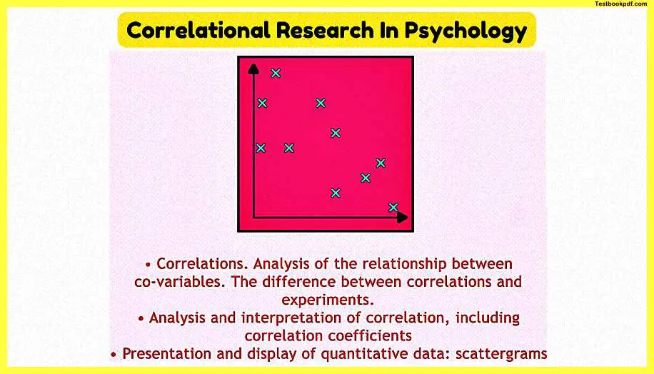
Correlation is a statistical technique that helps in analyzing the relationship between two or more variables.
It’s useful to consider how different a correlational study is from an experimental study. As a reminder, in an experiment, the researcher manipulates an independent variable and then measures how the variation of the independent variable influences the measurement of a dependent variable. In a correlation the researcher does not manipulate any variables, they just measure. A correlation has two co-variables, these are simply variables that a researcher has measured and then compares. We could measure and then compare, for example, age, IQ, reaction time, bank account balance, number of pets, height, and hostility level. When the data has been collected by the researcher, they can then display this data on a graph called a scattergram.
Types of correlation
- Positive
- Negative
- Linear
- Curvilinear
- Simple
- Partial
- Multiple
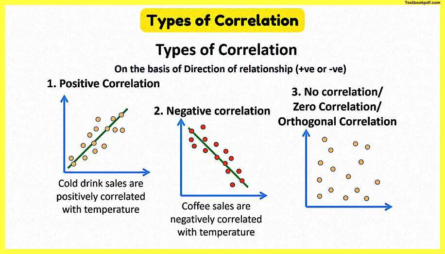
1. Positive correlation – if two variables X and Y move in the same direction i.e if one Rises other Rises too and vice versa.
For example – price and supply
2. Negative correlation – if two variables X and Y move in the opposite direction i.e if one Rises other false and vice versa.
for example – demand and price
3. Linear correlation – if the ratio of change of two variables X and Y remain constant throughout then they are said to be linear correlated.
For example – if every time supply of Commodity rise by 20% as per Price rise by 10% then two variable have a linear relationship if we plot it on paper uh that all the points will lie on a straight line.
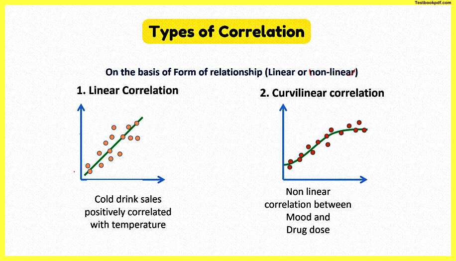
4. Curvy linear correlation – if the ratio of change between two variables is not constant but changes.
For example – When every time the price of a commodity rise by 10% then sometimes its supplies rise by 20% sometimes by 10% every plot on a paper then it graph will give a curve.
5. Simple correlation – when we study the relationship between two variables only.
For example – the relationship between Price and Demand.
6. Partial Correlation – When three or more variables are taken but the relationship between only two of the variable is studied assuming other variables as constant.
For example – under constant temperature, if the relationship between the amount of rainfall and wheat yield is studied.
7. Multiple correlations – When we study the relationship among three or more variables then it is called multiple correlations.
For example – if we study the relationship between rainfall temperature and the yield of wheat.
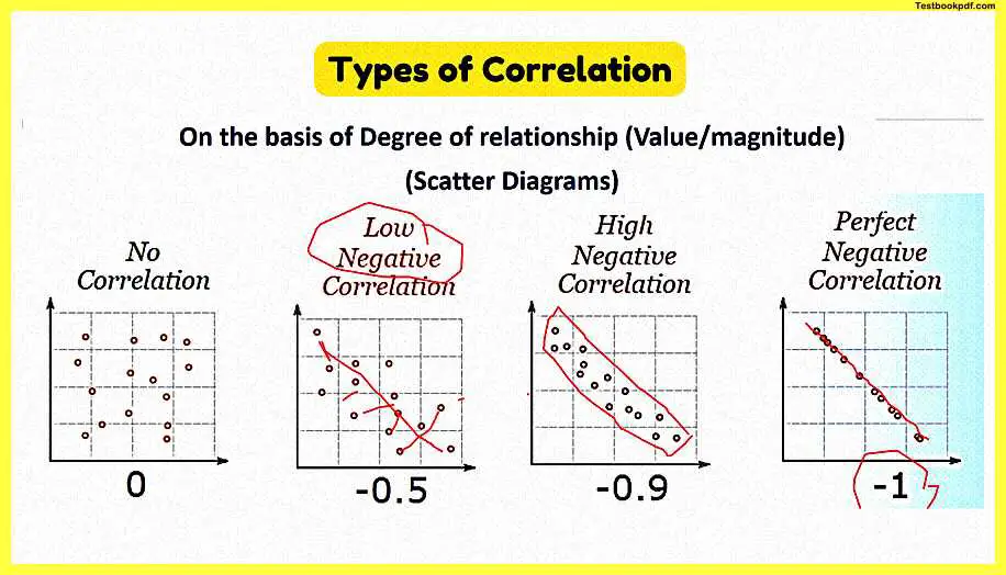
Methods of study correlation Given Below –
Graph method
- Scatter diagram
- Correlation graph
Algebraic method
- Karl Pearson coefficient of correlation
- Rank correlation
- Concurrent deviation method
Scattergram
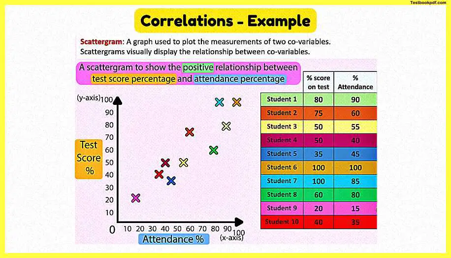
Let’s think of an example: a researcher may be interested in the relationship between the percentage score on a final class test against the students’ attendance over the year. So at the end of the year, they can use the data collected for each student. Let me show you how to draw a scatter graph, let’s plot an X and Y axis. When plotting a correlation on a scattergraph either variable can be on the X and Y axis. We will pick a reasonable scale and will add labels to each axis and give the graph a title. Now as we enter our data each dot is a data pair for each measurement of one student. So let me take the data points for each student and plot them from the table.
Now what we may expect to see with this data is a positive correlation, this means when one co-variable increases the other co-variable increases. So as you may have guessed a negative correlation is when one co-variable increases and the other decreases. We can also have zero correlation, and this is when there is no relationship between the co-variables.
Correlation Coefficient – Measuring correlation
It is useful to state if a relationship is positive, negative, or zero, but that’s a little simple, and we can be more precise. We may want to describe correlations as weak or strong, or even perfect. We can describe the strength of a correlation all the way from a perfect negative to a perfect positive with a number called a correlation coefficient. A perfect negative is -1 and a perfect positive is 1 this means the change in one co-variable is exactly proportional to the change in the other. No correlation or zero of course would be 0. We can also describe both negative and positive correlations as strong, moderate, or weak. We can use statistical tests like Pearson’s and Spearmans to calculate correlation coefficients, and psychologists will often judge a coefficient of 0.8 or higher as a strong correlation. Two observers may test their inter-rater reliability using a test of correlation.
Evaluation of the use of correlation
When considering evaluations, one of the most important critical evaluations is that a phrase you may have heard before, correlation does not show causation. What this means is that even though there may be a relationship between two variables, we are not sure which variable is altering the other co-variable, or is there an unknown third variable. Even in my example, you may assume the low attendance caused poor exam performance. But an alternate possibility is the students who struggled with the difficulty of the work avoided class more than the more able students. And with correlations, there can be a third factor that changes both co-variables. One famous example is the positive correlation between ice cream sales and death by drowning. It really looks from this real set of data that the more ice cream is sold the more kids drown. So what’s going on here? Should we ban ice cream? Well, it’s of course a third variable, the temperature. As the weather gets warmer, more people buy ice cream, and more people go swimming at the beach. So linked to that point, just measuring two pre-existing co-variables gives the researcher no control over potential extraneous variables.
However, we can say a positive evaluation of using correlations in research is it can highlight potential causal relationships that researchers can then use to make predictions, and investigate further with experimentation. Also, correlational research often has few ethical problems when researchers are often measuring pre-existing variables. Also, the correlation coefficient is a useful tool for describing the strength of a correlation.
Positive and Negative Correlation
Let’s take a look at a concept called correlation which is all about trying to see whether there is a relationship between variables that might be relevant to business decisions
Correlation
let’s imagine you you own you run an ice cream business if it gets really hot outside would you expect sales to increase yeah probably it’s definitely a relationship isn’t there between the warmer weather and people wanting to demand more ice cream
what about this one if you run a soft drinks business and you decided that you wanted to increase your advertising spend in order to increase sales would that work is there some kind of relationship between advertising spend and sales well possibly
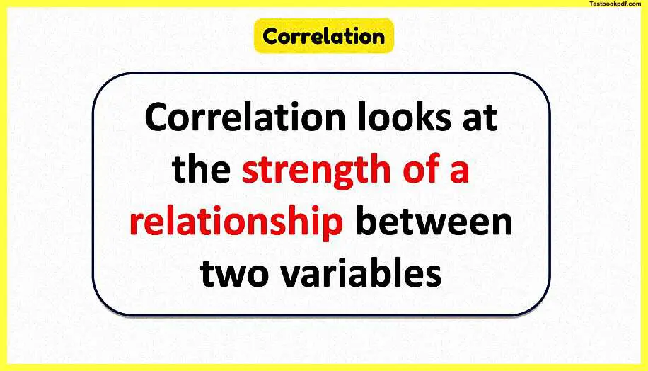
lastly what about if you’re running a business is there some kind of relationship between maximizing employee satisfaction and maximizing customer satisfaction well the answer to that third question yes, there is has been some fairly recent data that shows there is a positive relationship between employee satisfaction leading to higher customer satisfaction and this is a great example of correlation so the correlation is all about looking at the nature the strength of the relationship between two variables.
Correlation Variables
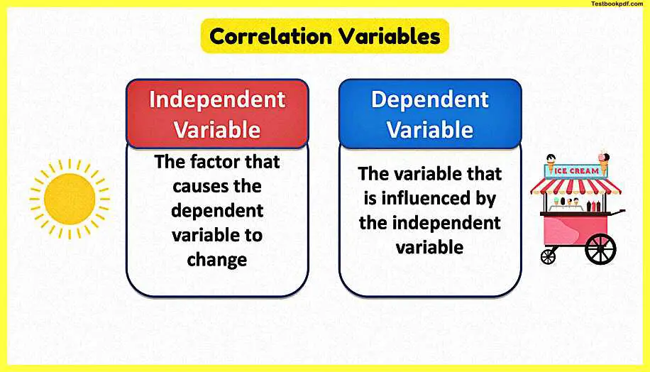
so let’s just spend a few minutes just going through what we mean by this concept of a relationship between two variables the starting point of correlation is to remember that there are two parts to this there is a variable that causes something to happen this is the independent variable this is the factor that causes something else to change and what changes are what’s known as the dependent variable now put this back into our question from earlier on, in this case, remember back to the ice cream question the independent variable would be the increase in outside temperatures may be a prolonged period of warm sunshine that might be the factor that causes a change in the dependent variable in this case sales of ice cream which may be influenced by hot weather so that’s the key with correlation is to remember that we’re looking at cause and defect and is there is a relationship and if there is what kind of relationship is there.
Plotting Correlation – Examples
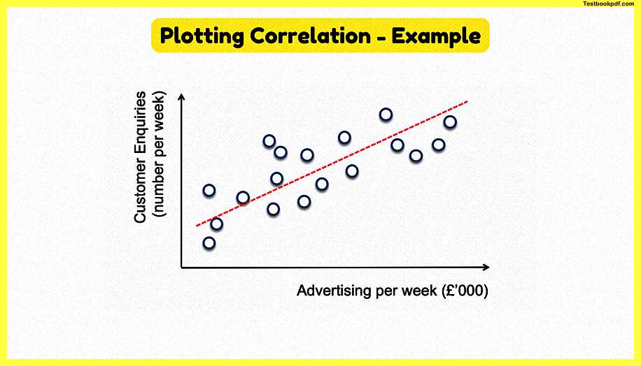
now just to show you to take this concept further let’s imagine we did some research and we identified a series of data points that compared a particular level of spending on advertising per week with the number of customer inquiries that we get into the business there we go those are the data points that are mapped there so you might have had a data point up here that amount of advertising and that led to a certain number of customer inquiries per week perhaps down here fewer or lower spend on advertising led to a lower number of customer inquiries is there a relationship between advertising per week and the number of customer inquiries well the answer is yes it looks like there is from those data points which are plotted there and you can then plot what’s known as a line of least resistance or a line of best fit into the data point to measure the relationship.
Explaining the Scatter Chart – 1
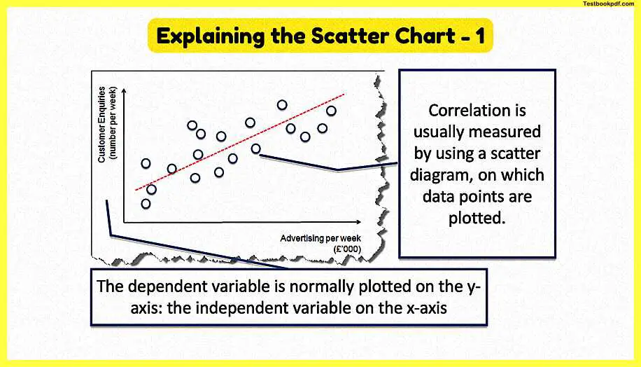
so correlation what we normally do is measure it by using what’s under a scatter diagram where we plot all the different points don’t forget the y y-axis here on the left we normally use the y-axis to show the dependent variable and on the bottom the independent variable the factor that causes the change
Explaining the Scatter Chart – 2
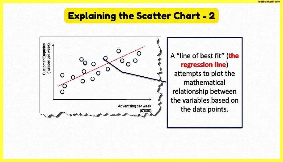
and what we can then do is apply what’s known as a regression line or a line of best fit to try to work out what is the distance between those data points what is the relationship the strength of the relationship now you won’t be asked to calculate a line of best fit or a regression line in a little business but it’s just understanding that this helps us identify the nature of the relationship.
Types of Correlation
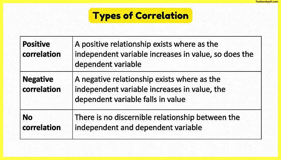
now this is quite important it might be worth pausing the video just for a few seconds just to jot these down into your notes or just to make sure that you’re happy there are three different types of correlation firstly there is what’s known as positive correlation and what this means is as the independent variable increases so too does the dependent variable so in the case of our ice cream example the independent variable was the the temperature the heat and the dependent variable was the sales of ice cream and we identified a positive correlation didn’t we because as temperatures rose so too did sales of ice cream or we expected that to be the case negative correlation means that there is a relationship but it means that as the independent variable increases the dependent variable falls value and lastly no correlation plotting a series of data points we can’t discern a particular relationship we can’t try to predict what’s going to happen between the independent and dependent variable.
Positive Correlation
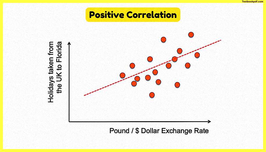
so just to remind ourselves here the two key three key types of correlation there positive correlation as the independent variable increases so too does a dependent variable in this case this chart here shows the dollar the pound the dollar exchange rate which is our dependent um sorry independent variable on the x-axis there it is and as that increases so too does the number of holidays that people take from the UK to Florida and we would expect that to be the case because as the pound gets stronger as the exchange rate increases that make overseas holidays more affordable your pound goes further in Florida at Disneyland and MGM CDs and the rest it looks like there’s a positive correlation.
Negative Correlation
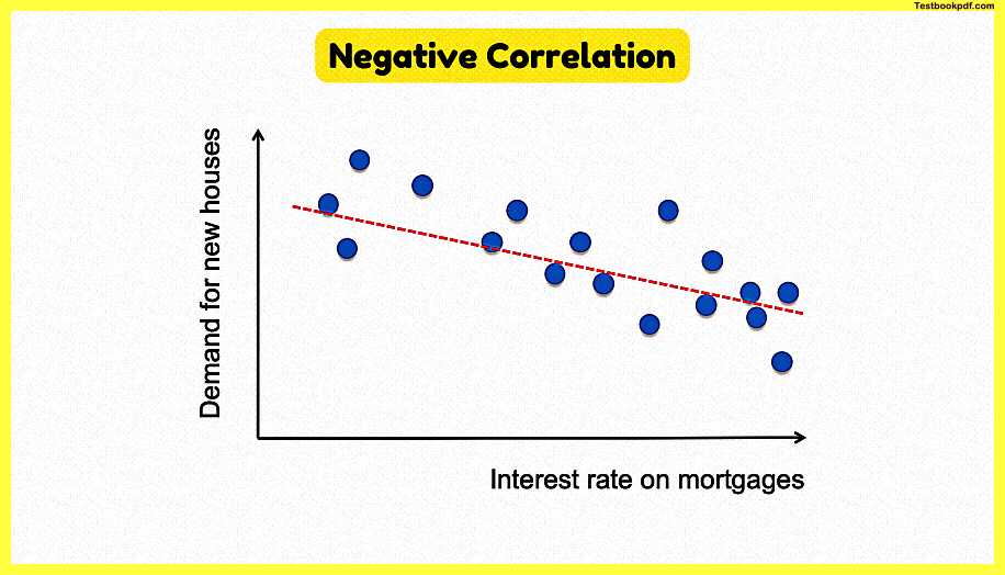
now here’s an example of a negative correlation in this case our independent variable on the x-axis is the interest rate that gets paid all you have to pay on your mortgage and the dependent variable is the demand for new houses and the data points there suggest that as interest rates fall demand for new houses increases or vice versa demand falls as interest rates go up negative correlation
No Correlation
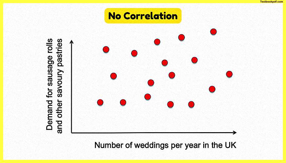
and here we go here’s an example where the data suggests there’s no correlation in this case we try to plot a relationship between the number of weddings per year in the uk and the demand for sausage rolls and savory pastries or pasties including vegan sausage rolls and I don’t know whether that date is right or not but you can see from the data plotted there that there isn’t really a clear relationship between the two of them and neither would you expect it to be.
Strong and Weak Correlation
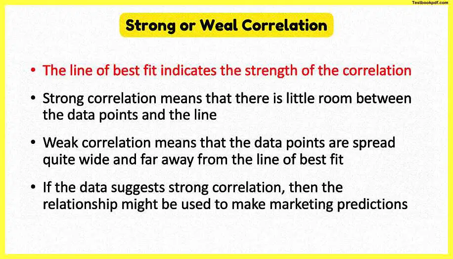
There we go the last thing just to say is don’t forget correlation is about the relationship but it’s mainly about the strength of the relationship it can be positive and negative strong correlation means there is a little space between the data points and the line of best fit which means that there is a predictable relationship there a weak correlation says yeah there is a relationship but it’s not quite as predictable as it would be with a strong relationship there we go no calculations involved there but hopefully that’s a useful introduction to this idea of positive and negative correlation.
Thanks for reading this Psychology related article share it with your friends.
Read also:
